
Soulseek — the only place for music lovers, refreshed.
How this amazing app can be improved by using common sense, empathy and best practices.
Technically speaking Soulseek is a peer-to-peer (P2P) file-sharing network and application. The term it is used mostly to exchange music, although users are able to share a variety of files.
In real life, it’s used by music lovers all over the world interested in diverse set of genres like rock, reggae, punk, jazz, disco and so on. Nothing fancy here, but the thing is that people who are using this product are not sharing or looking for Justin Bieber or Damian Marley or Maroon 5 or other super promoted and super marketed musicians. It’s for people who are looking for more than this.
User onboarding
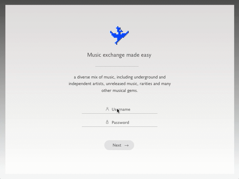
The actual user onboarding process is terrible, once you open the app you get this:
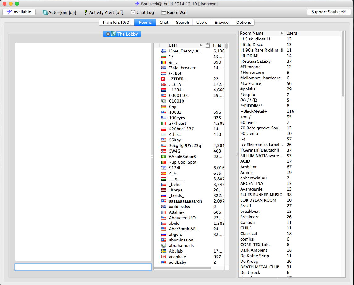
You see a lot of buttons, a lot of users, a white empty chat wall, a lot of rooms. The only way to figure out is just to play around, click here, click there, basically you have to guess every move. It’s like playing hangman, you just get one letter at start and after that you have to figure it out. Also, in order to download something from someone you have to create an account and share some files.
How we can improve this whole onboarding process just be applying some common sense, best practices and putting ourselves in the shoes of a user?
As a user I want to be welcomed with a short description of what is this app about and after this to choose what music genre(s) I’m interested in. It’s simple.
Small note: Here i’m just exposing a perspective view. I’m not trying to present a very in depth process. I’m trying to keep it as short as possible.
The user interface
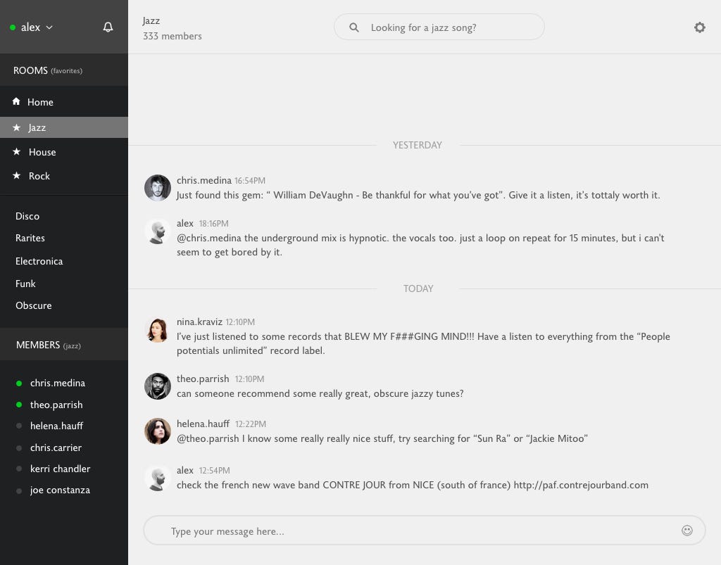
Once I open the app, I already have the music genres I have chosen at the first step as favorites, in this way I will not have to choose them over and over.
Everything you need is at your disposal. I removed all the fluff and kept just the essential. I didn’t do it just because I think so, I have the same frustrations as many active users.
So, what I did was to observe the pain and heal it.
Let’s explore a bit!
Three essential features that people are using are now visible straightaway:
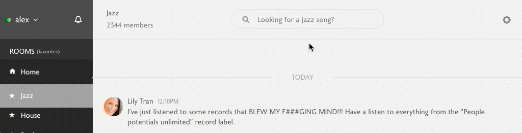
1. Rooms, which are the most important. There you can search and chat either on the general room or with individual members.
Here I’ve decided to take a more “context aware” path. For example, if you are selecting the “Jazz” room (as you see in the screenshot) you can search through that room by default and you can see the members in that room.
How can we make the user to understand this?
What I did here was splitting the motion process in two steps, first and the most important (that’s why there it’s a small delay between the steps) it’s to update the search placeholder from “Looking for a specific song” to “Looking for a jazz song” to let the user know that once the room it’s changed the search functionality will change accordingly.
The next step is changing the main chat area and the members list.
2. Search, which now it’ more friendly and easy to use. As I said earlier, more “context aware”.
More exactly the search system, works like this:
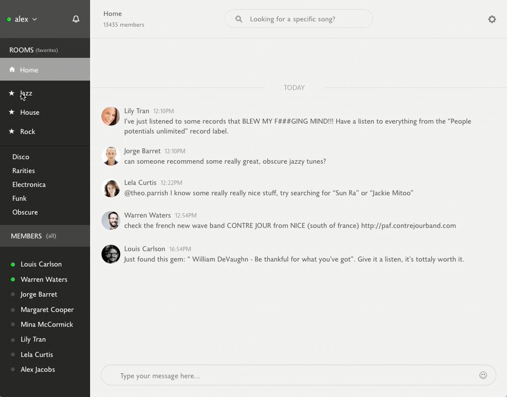
By default, you are on “Home” tab where you can search through all of your favorites rooms.
When you click on “Jazz” for example, you will search just through jazz music. Makes sense!? However, let’s say that you change your mind and you want to search for other type of music right from the search area.
Here’s what you can do:
So, whenever you are trying to search for something the search will extend with the possibility to change the room in which you want to perform a search.
3. Members list, as you probably noticed changes simultaneously with the room. When you select “Jazz” the members list it’s updated automatically.
Online members are listed first and right after you see your most recent activity, like recent chats with room members which are not online at the moment.
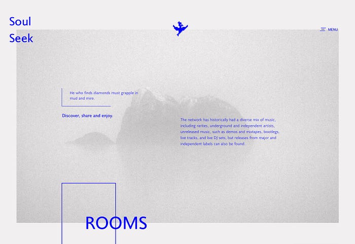
The landing page.

As you probably notice there is no information regarding what this product is, what it does, how it works, who is it for or other basic information that people need to know straightaway.
If you browse around you will only find out that Soulseek is:
Is an ad-free, spyware free, just plain free file sharing network for Windows, Mac and Linux. Our rooms, search engine and search correlation system make it easy for you to find people with similar interests, and make new discoveries!
Which doesn’t tell so much, either.
How this can be easily fixed applying the same principles we used for the onborading process and interface:
And a pinch of visual design to attract the user.
You can see more pixels on my dribbble post.
Ok, a lot of things are missing but this is not the point of this article. The point is that, by having a broader perspective of a product you can easily improve it by applying some basic principles like common sense, empathy and best practices.
Thank you for reading!